When retailers come to us to look at our AI-driven lifecycle pricing solutions, the first people we talk with—the “point persons” responsible for overseeing pricing decisions—are usually quick to grasp the real benefits. They’re eternally striving for that ideal markdown “sweet spot” for every SKU—accelerating sell-through while preserving—if not squandering—margin. But without a unified, data-driven markdown strategy, they’re often the first to concede their haphazard, decentralized markdowns are “a mess”.
That’s okay. At the risk of sounding like TV’s Dr. Phil, the crucial first step in finding help is acknowledging you need help.
But when those point people in turn make their case internally for adopting our solutions, others within the company may need a bit more convincing—namely the CFO or other senior management, who tend to pre-judge every new idea strictly in terms of short-term ROI.
We can help support a compelling business case by presenting the data visually, as we did for the women’s wear division of a large North American retailer. We worked from a data set of the company’s actual markdown history over the course of a year—over 12,700 items spanning seven departments, totaling $63 million in markdown sales.
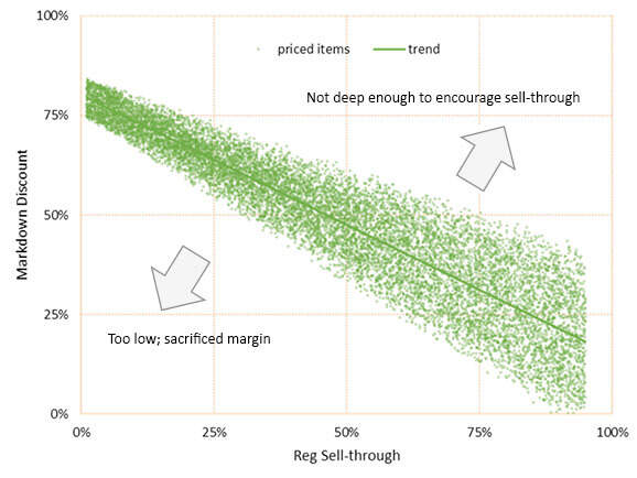
This first chart illustrates the correlation between markdowns and sell-through in a “perfect world” scenario. Every green dot represents a single markdown-priced item. Hypothetically, markdowns shouldn’t stray too far from a diagonal trendline—discounts should not be unnecessarily too low, nor too steep, to spur optimized sell-through.

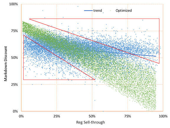
We next plotted the company’s actual sales—individual marked-down SKUs represented by the overlay of blue dots. We can see the trend line here is far less dynamic—almost horizontal versus diagonal.

The particularly troubling aspect of this chart is the number of dots that trend within the red triangles. These represent markdowns that either weren’t attractive enough to accelerate slow-selling items, or unnecessarily deep discounts that ate away at margins. Both resulted in direct losses of net revenue.
How do so many of the dots wind up in the triangles? Particularly among fashion retailers, markdowns are left to various individual buyers and merchandisers. Even those who don’t consider this the “least glamorous” part of their job aren’t born number-crunchers. They’re reliant upon inadequate tools—piecing together sell-through rates and price adjustments via cumbersome spreadsheets—without the benefit of real data to guide their decisions. Those stray blue dots at the far reaches of the chart may as well have been determined by a dart board.
When we can simplify these numbers visually, we can help lay the groundwork for a compelling business case: What would be the advantages of eliminating a significant percentage of the blues? What if we could stop taking discounts that aren’t moving inventory? What if we could get a better grasp of what those items are and be more knowledgeable as we’re making changes? Would we feel better that we’re not just slashing everything when trying to exit the season? Would we be more confident in decisions and results when we’re stuck in an overstock situation, and need a clear and quick path out of it? What might all those benefits be worth—ROI as well as better allocation of resources?
While any vendor is quick to throw together a demo or pilot, what we try to do for retailers is to demonstrate how to increase strategic control of pricing decisions—creating far more green dots than blue—enough to easily win over any skeptical CFO. In this case, we estimated this retailer could increase revenue by 5%--or $3.1 million in sales, with $2 million in margin.
By providing a centralized, data-driven markdown structure, we can free harried merchandisers to devote more time to their most important role—looking ahead at next season and choosing attractive new merchandise that ideally never appears on the clearance rack at all.

